︎ All Projects
![]()
![]()
Customer journey user flow
Concept: After researching examples of online catalogs, we created the concept of “shopping at the dinner table”.
![]()
![]()
Product Overlay Wireframes
When a customer interacted with a hotpsot, an overlay would show a description, CTA to purchase, and links to recipes and articles featuring the product.
![]()
![]()
Editorial Content Wireframes
Each product overlay contained a link to the online store, as well as links to related editorial content.
![]()
![]()
Mobile Navigation Challenges
Due to evolving requirements, it was difficult to design an appropriate navigation for the site. At some points in the project, there were only 2 pages on the site; at other points, there were up 6.
![]()
I researched mobile navigation solutions and decided that the best course of action was progressively collapsing navigation, rather than a hamburger menu. It was a perfect solution to safeguard us against last-minute navigation additions.
Two questions we had before user testing:
1. Do customers prefer navigating with hotspots, or the carousel below the table?
2. Do customers want the ability to collapse the carousel to see the table better?
What we discovered:
1. Customers were almost evenly split between the two methods of navigation.
2. Almost none of them collapsed the carousel.
Action taken
We removed the collapse and expand tab above the carousel and kept both navigation methods.
![]()
1.9 million
Unique visits from November 1 to December 31, 2017
2:44–4:42 minutes
Average time users spent interacting
34%
Referral to the WFM online store
︎ All Projects
Holiday Table
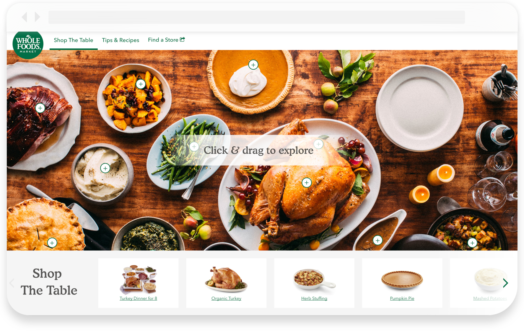
The final product
Goal: An inspiring path to purchase
The objective was to create an engaging digital counterpart to the Whole Foods Market printed holiday catalog. The key performance indicator was its ability to drive trips to our online store.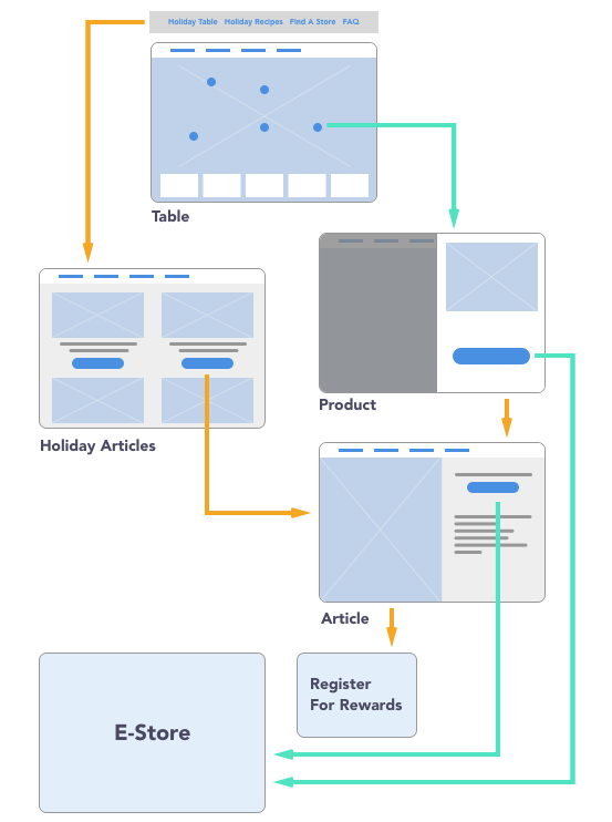
Customer journey user flow
Concept: After researching examples of online catalogs, we created the concept of “shopping at the dinner table”.
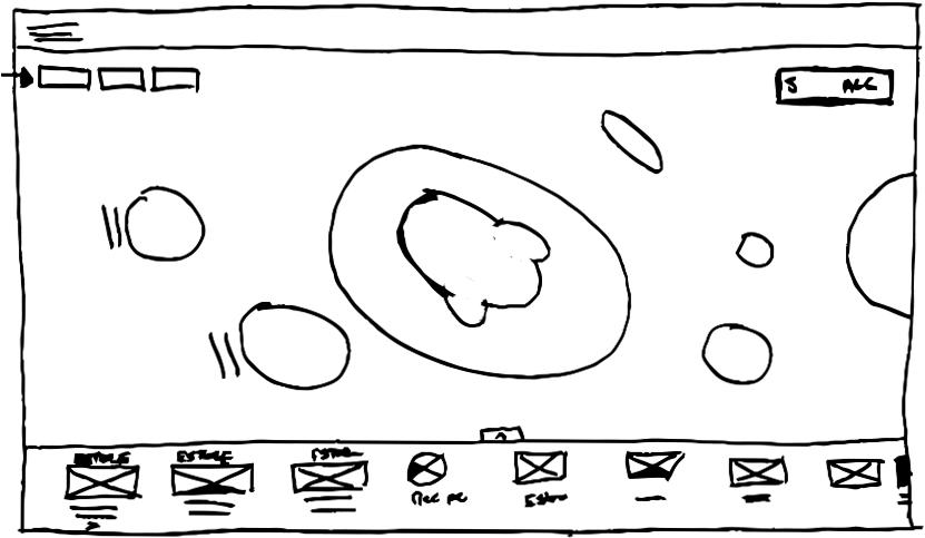


First sketches of how the table, overlays, and articles would look and function
Table Wireframes
Each food item on the table had a corresponding hotspot that when tapped, revealed more information about the product and gave customers the opportunity to purchase it.

Product Overlay Wireframes
When a customer interacted with a hotpsot, an overlay would show a description, CTA to purchase, and links to recipes and articles featuring the product.


Editorial Content Wireframes
Each product overlay contained a link to the online store, as well as links to related editorial content.

Mobile Navigation Challenges
Due to evolving requirements, it was difficult to design an appropriate navigation for the site. At some points in the project, there were only 2 pages on the site; at other points, there were up 6. 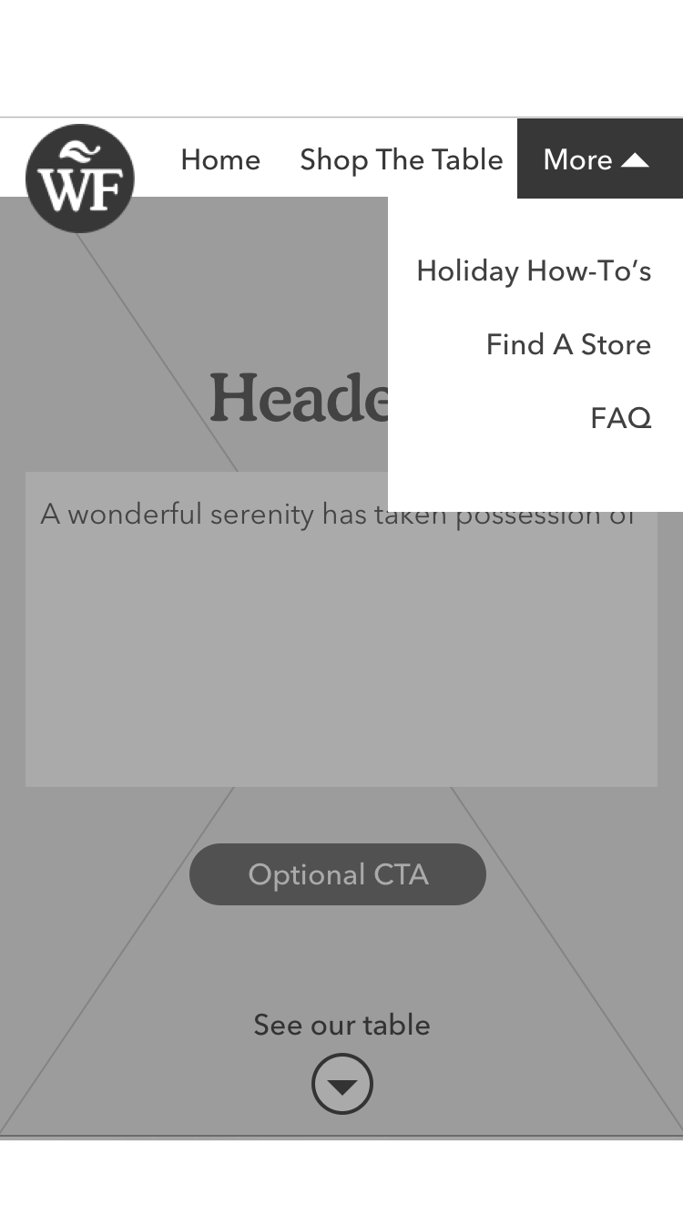
Simplification Based On User Testing
Two questions we had before user testing:
1. Do customers prefer navigating with hotspots, or the carousel below the table?
2. Do customers want the ability to collapse the carousel to see the table better?
What we discovered:
1. Customers were almost evenly split between the two methods of navigation.
2. Almost none of them collapsed the carousel.
Action taken
We removed the collapse and expand tab above the carousel and kept both navigation methods.

Results
1.9 million
Unique visits from November 1 to December 31, 2017
2:44–4:42 minutes
Average time users spent interacting
34%
Referral to the WFM online store
︎ All Projects