︎ All Projects
Whole Foods Market
Year: 2017
Role: UX Designer
Deliverables: Wireframes, microcopy, UI, and interaction guidelines.
Team: Product Manager, Art Director, Visual Designer, Copywriter, Development Team, and other stakeholders.
![]()
![]()
![]()
The final product on mobile
![]()
Header on mobile. Old (L) New (R).
![]()
Old Store Landing Page
![]()
New Store Landing Page Wireframe
![]()
Old Product Page
![]()
![]()
Old breadcrumbs
![]()
![]()
![]()
︎ All Projects
Whole Foods Market
Online Store
Year: 2017
Role: UX Designer
Deliverables: Wireframes, microcopy, UI, and interaction guidelines.
Team: Product Manager, Art Director, Visual Designer, Copywriter, Development Team, and other stakeholders.
The final product
Goal: Mobile Improvement
The online store improvements were focused on mobile, where most of our traffic comes from. The purpose was to make it easier for customers to shop.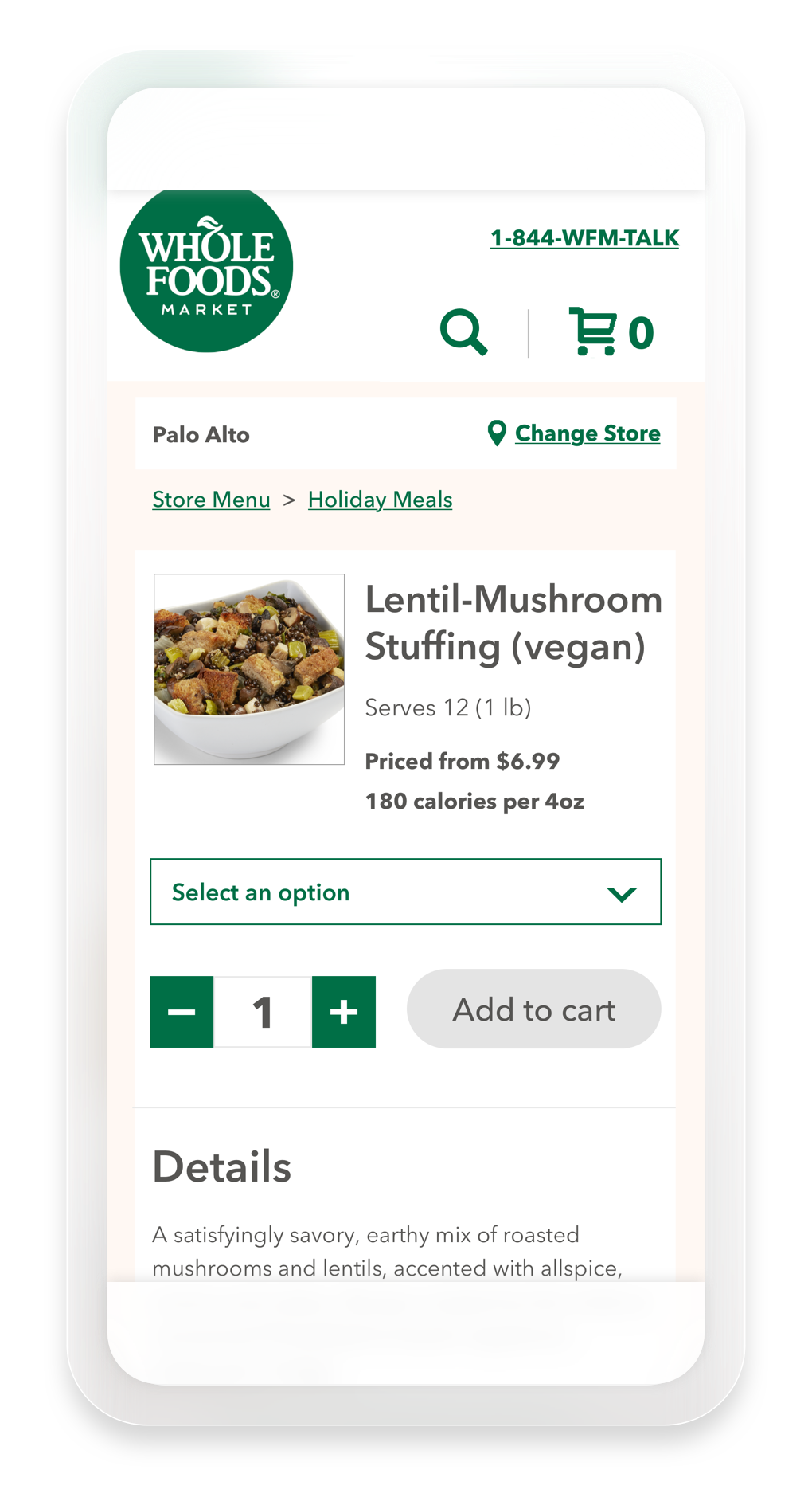
The final product on mobile
Header
I redesigned the header of the WFM online store to give visibility to a new help number and optimize navigation. The “Change store” link was placed in context with the store name, and the search icon joined the shopping cart in the header. This gave more prominence to search and made it easier to find.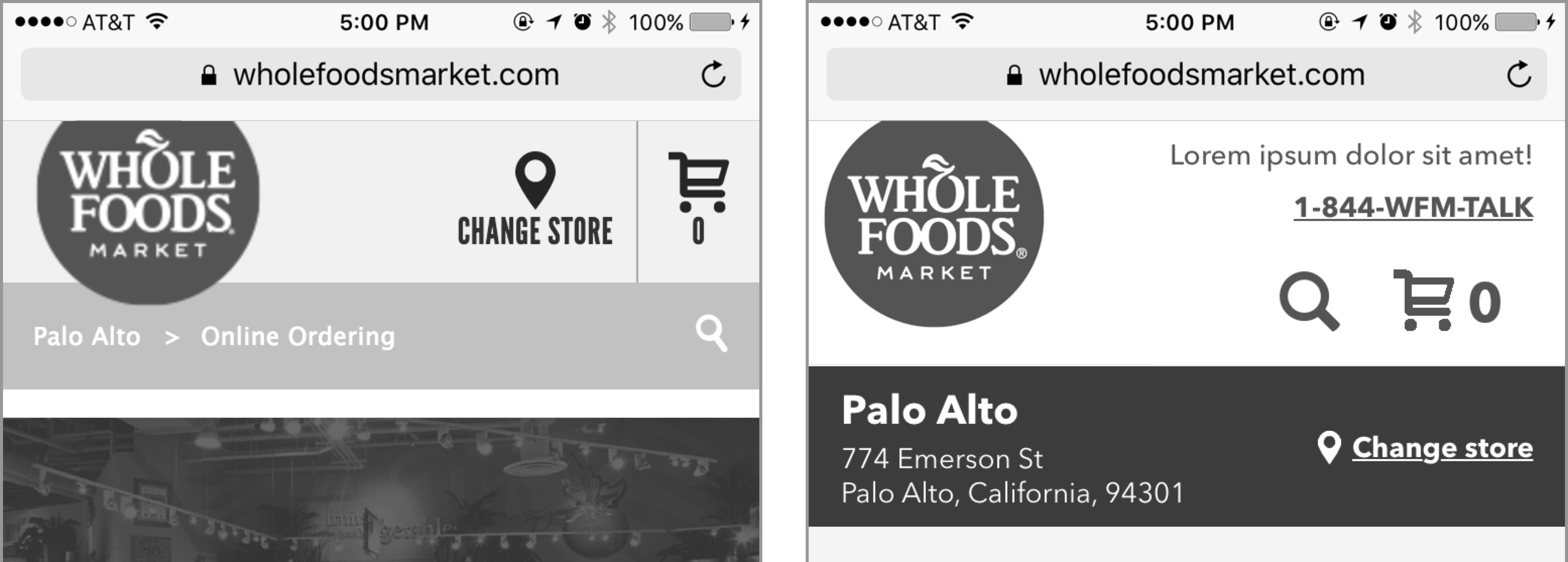
Header on mobile. Old (L) New (R).
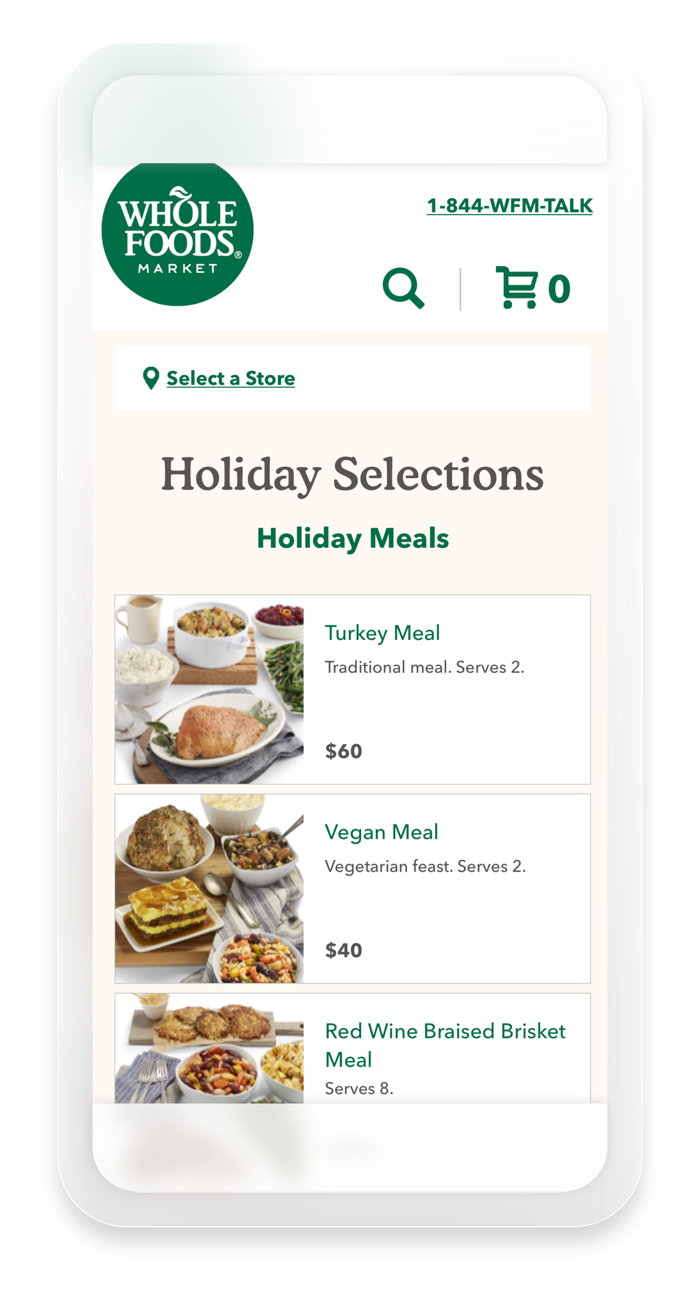
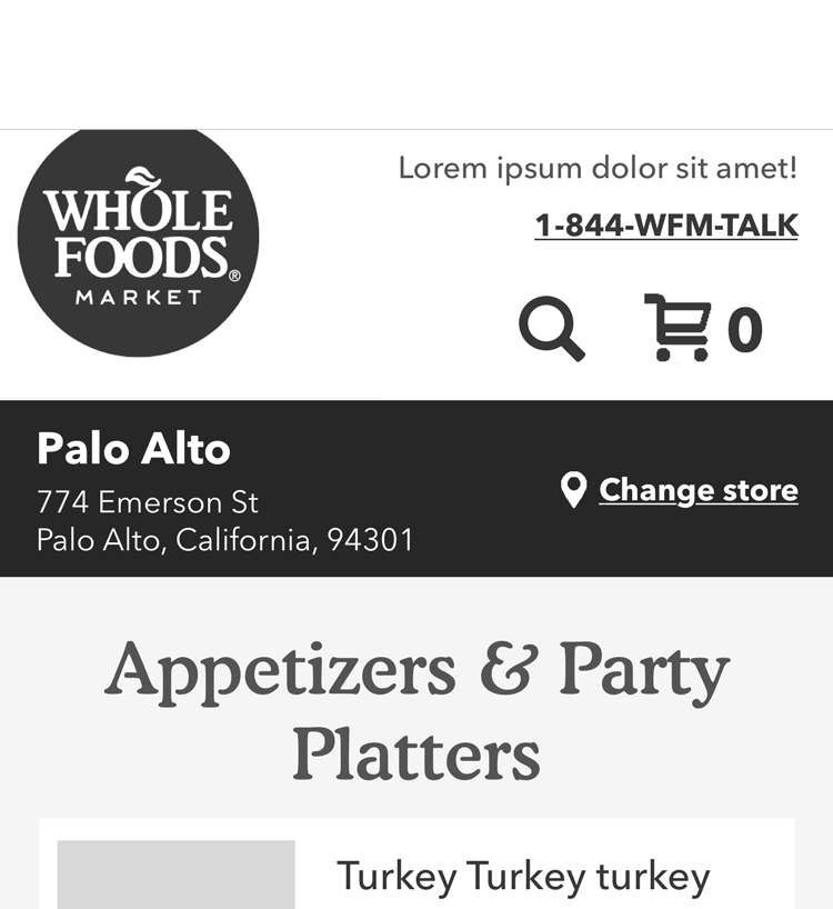
Store Landing Page
Customers begin their journey by selecting a store location. Once they choose a store, they are taken to its landing page. The old store landing page had many faults, including a lack of product imagery and a header that took up too much real estate on mobile.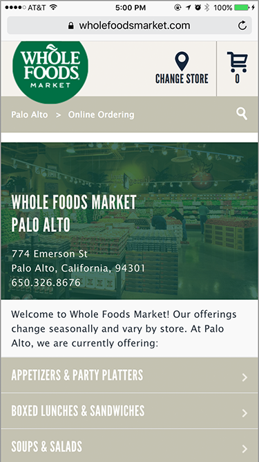
Old Store Landing Page
Improvements
The store landing page was redesigned to exclude the the store image. Instead, the space was used to showcase items so that customers would be encouraged to shop.
New Store Landing Page Wireframe
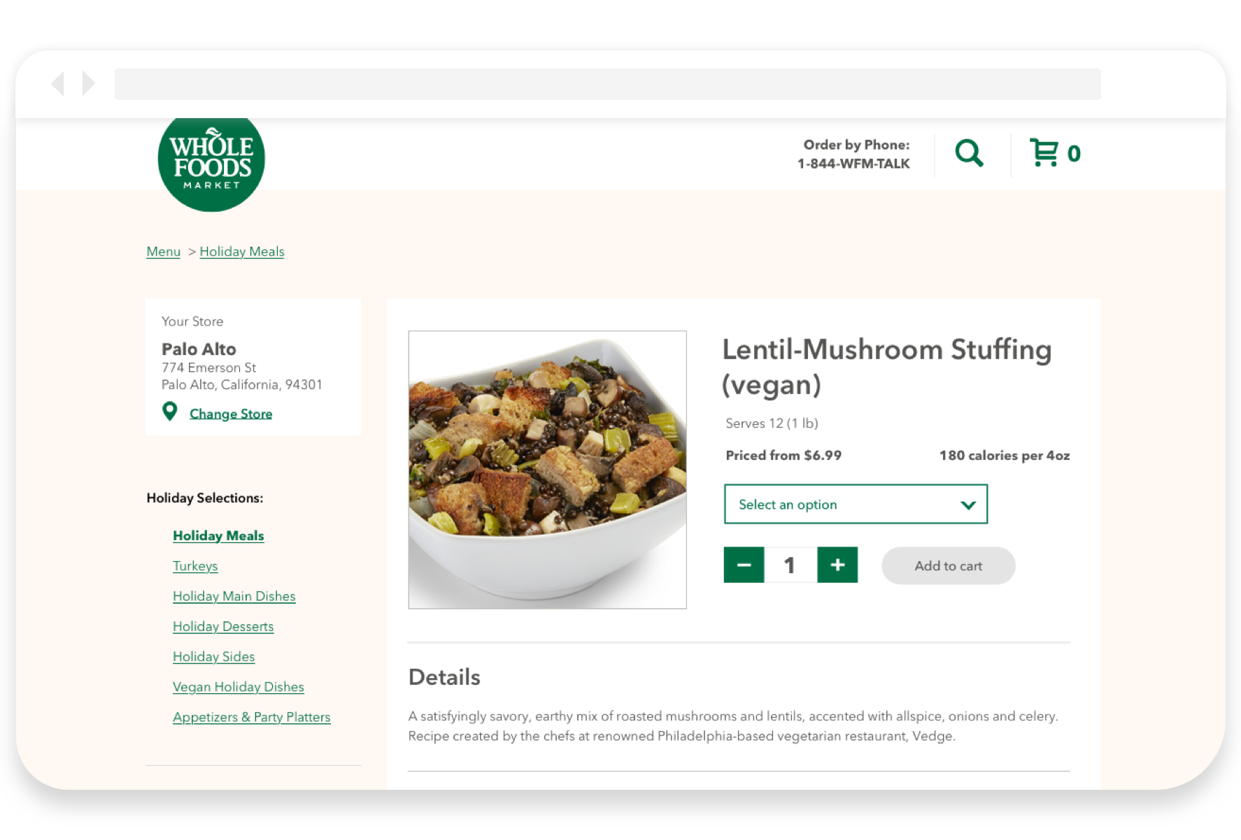
Item Selection Workflow
In the old version of the product page, customers would have to tap the “Select Options” button and choose the variation they wanted in a modal. Then, the customer would have to close that modal to continue adding items to their cart or shopping.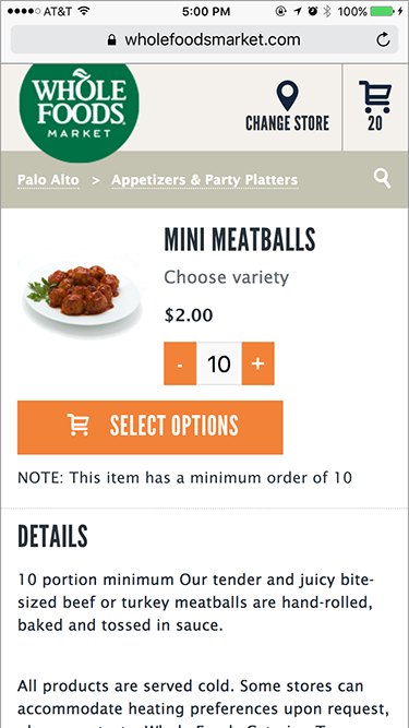
Old Product Page
Improvements
By incorporating a dropdown in the product page instead of the “Select Options” button, I made selecting product options quicker and easier for the customer.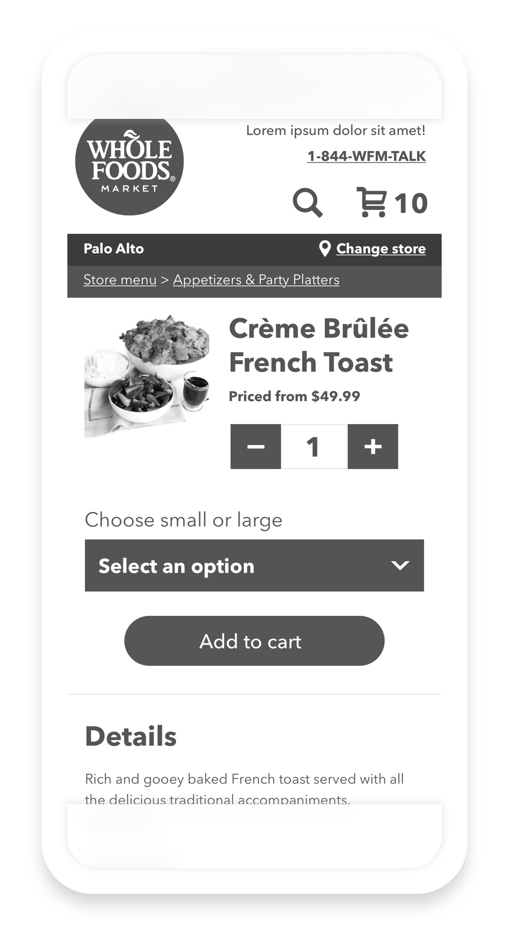
New Product Page Wireframe
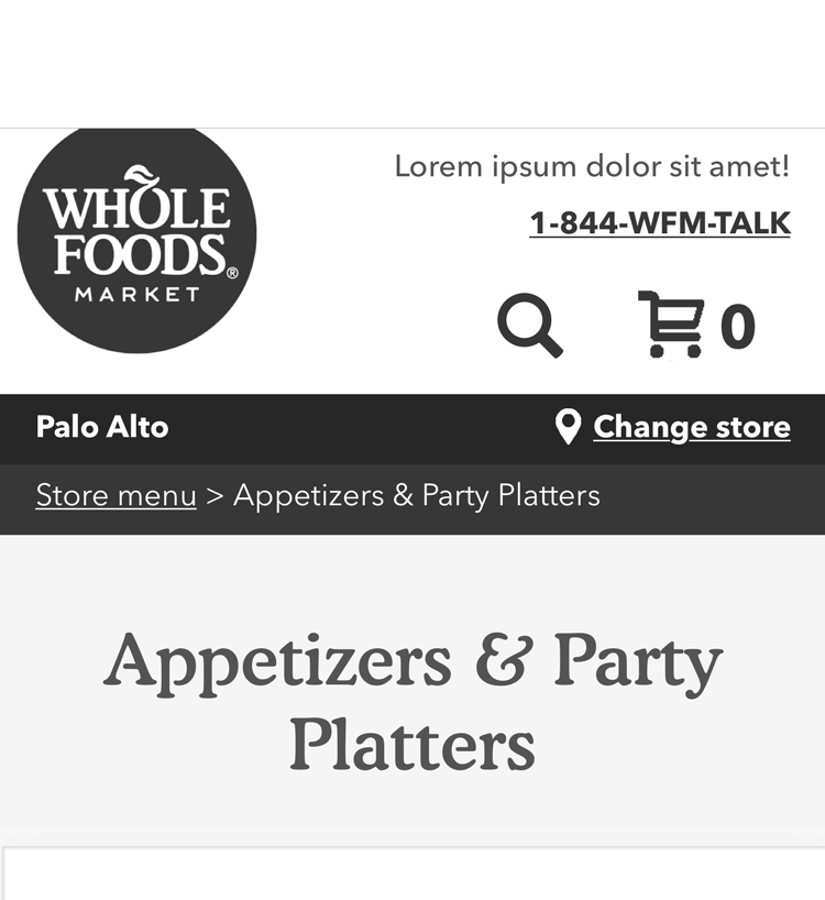
Breadcrumbs
Originally, the breadcrumbs included two inactive steps on the store landing page: the store name and “online ordering”. I removed these in favor of a more prominent store name and address. As the customer navigates deeper into the online store, the store name section minimizes and active breadcrumbs display underneath.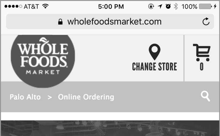
Old breadcrumbs

︎ All Projects