Vrbo calendar redesign
Web, iOS, & AndroidContributions: UX/UI, strategy, illustration, interaction, animation, & prototyping
Collaborators: product design partner, web engineers, content strategist, UX research, product manager
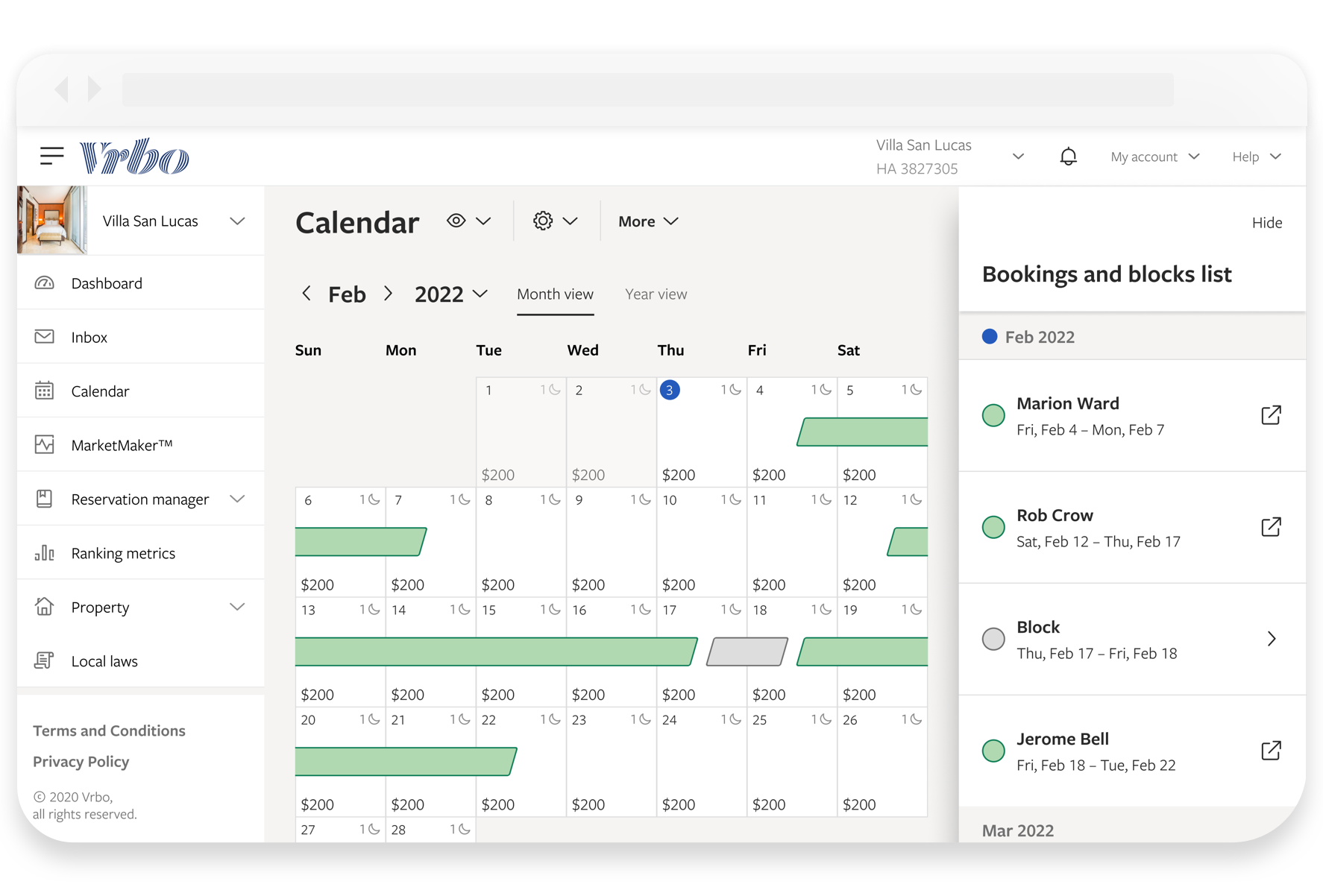
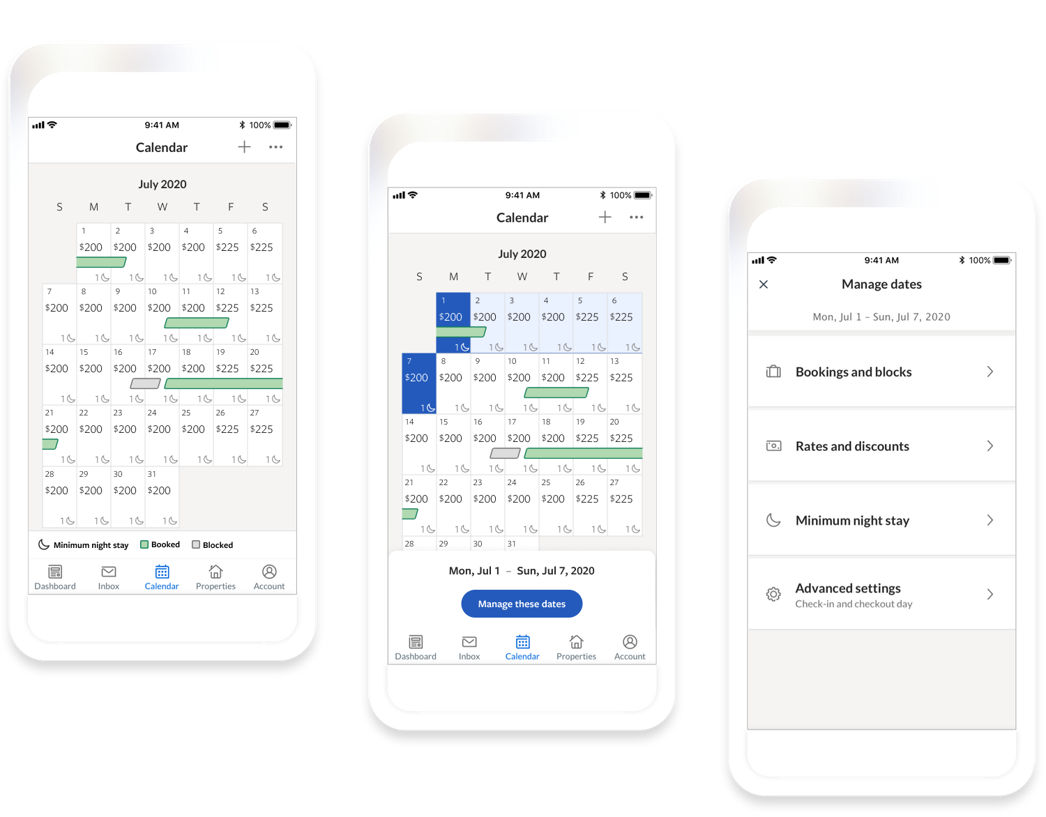
Problem: Vrbo noticed a trend of vacation rental owners canceling on guests because they had booked dates that weren't actually available or were the wrong rate. When we looked into feedback, we saw that owners were frustrated that they had to manage availability and rates on two separate calendars. To make things worse, they didn't understand how to accomplish the necessary tasks to keep their calendar up to date.
Outcomes: We directly addressed owner feedback by consolidating the features of both calendars into one. Since the old calendars were built with legacy tech, we had the opportunity to completely redesign and rebuild, making improvements along the way to:
- aria-labels and color contrast
- currency localization and large number scaling
- IA and feature organization
- success, loading, error, and warning messages
- calendar syncing
- usability (resolved 24 frictions and 2 blockers).
- our iOS and Android apps.
Beta: Before the general availability release, we launched a beta version of the calendar that partners could turn on or off at will. Over 6 months, we received a wave of positive feedback and observed that 76% of partners have kept the beta turned on.